Mage The Hero Discovered Review

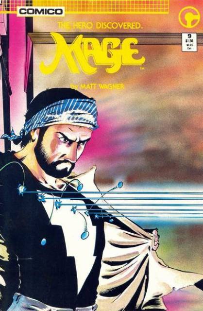
TITLE: Mage: The Hero Discovered
STORYTELLER: Matt Wagner with colors by Jeremy Cox and James Rochelle
PUBLISHER: Image (originally published via a smaller company)
ISSUES READ: All four volumes
YEAR OF PUBLICATION: 1984- 1986

OBSERVATIONS ON WRITING:

1. This series starts out very strong, promising a more modern/ adult update of the 1940s classic comic, Captain Marvel, which is explicitly referenced. An ordinary man is given powers from a mysterious, benevolent wizard, and told to use these powers to save the world. But unlike that golden age classic character, the hero is an adult.  It would be interesting to see how the superhero story can play out from a more adult point of view, with a character who has matured and grown up without superpowers, then suddenly finds himself in the middle of a more childlike battle where combatants are obviously evil or obviously good.

Unfortunately, after a very strong start, the book does little to nothing with this premise and Matt Wagner delivers a fairly standard superhero wrestling match.

OBSERVATIONS ON ART:

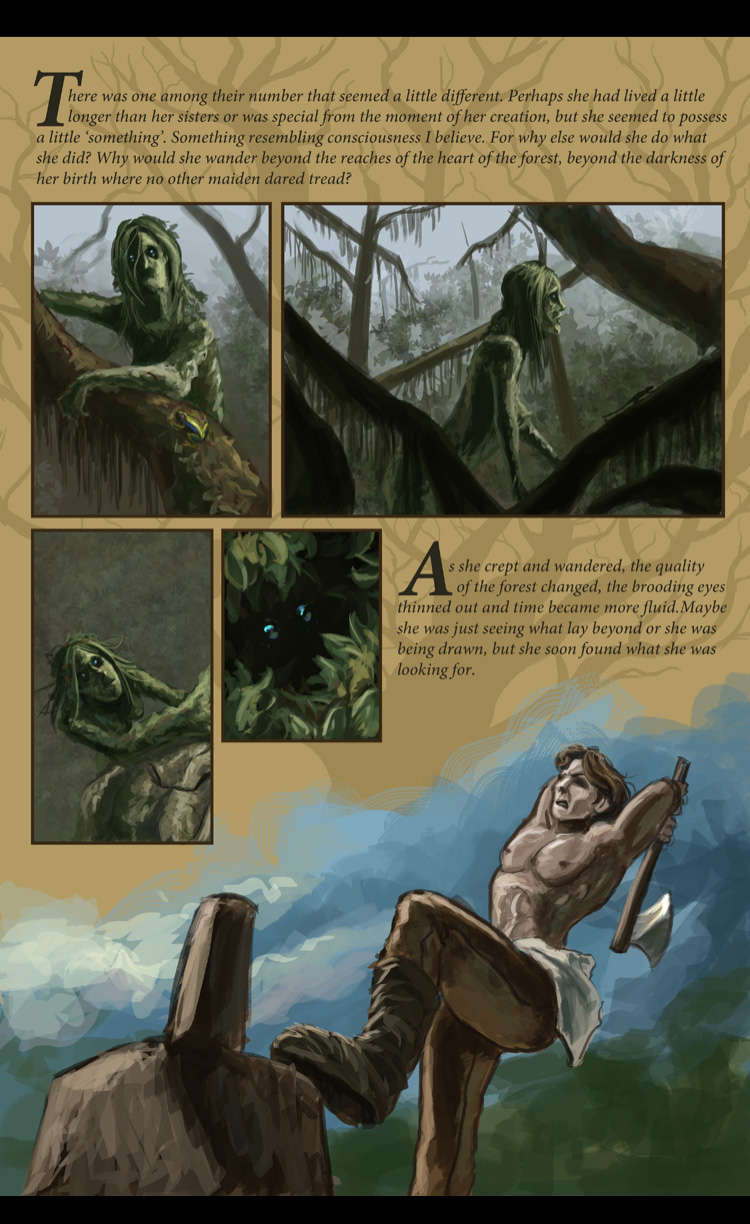
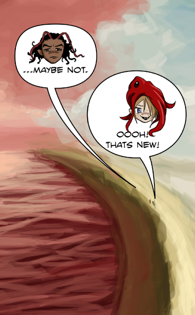
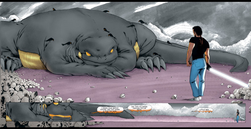
1. The character designs are terrific. These folks just don’t look like your typical superheros:

character design of teenage girl from Mage the Hero discovered

mage-hero-discovered cover

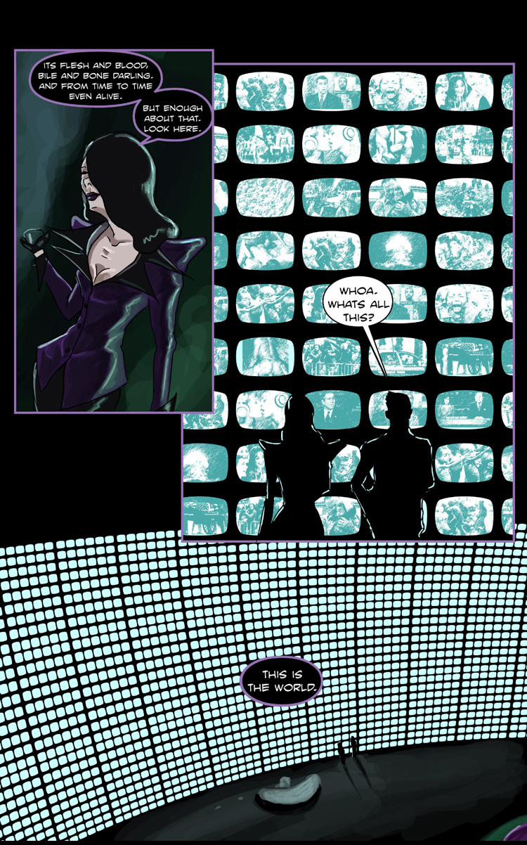
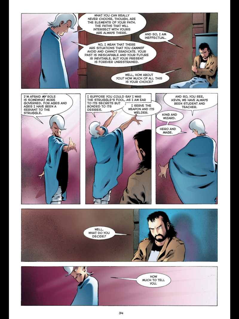
2. This is a visually innovative comic at times, but writer Matt Wagner too often falls into a problem where he has characters just standing around talking about the plot. A lot of scenes could stood to have been trimmed down.

It’s a shame, because Wagner is a talented artist with some interesting ideas, but during the weaker scenes the dialogue is kind of bad, and characters blather on about vague heroic nonsense: :

the main character stands around talking to the wizard

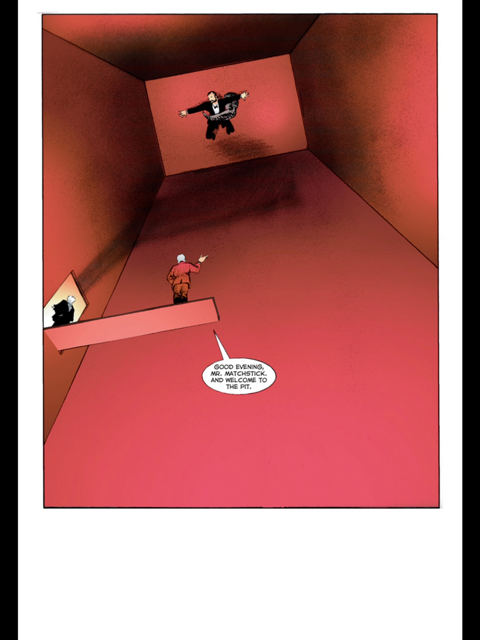
3. When Wagner takes a break from the boring dialogue and focuses on the art, he can deliver some really nice, Frank Miller-esque visual sequences. Just to highlight a few random bits: here’s a sequence where the hero is captured in a room that in my mind evokes abstract geometric art, with terrific compositional decisions:

Mage the hero discovered cubism is evoked while the hero is captured

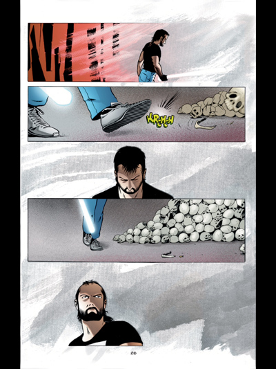
And here’s a cool three page sequence where the realistic background sort of dissolves into abstraction:

Mage the hero discovered background gets abstract

Mage the hero discovered fighting a dragon with abstract background

This is some really great stuff, with a great concept, great art, and great character designs, but the writing overall is not doing it any great favors.

REVIEW GRADE: C+

REVIEW:

I would compare this book to Scott Mccloud’s “Zot!” Both books star a hero with a lightning bolt on his shirt, both look back to the more innocent golden age of comics, and both are by a creator who does both the writing and art. Zot! in my mind is the better book, because as the series progresses, Mccloud starts experimenting with the writing and stretching the superhero story to its limits.

Mage: The Hero Discovered never really does that. There are good guys and there are bad guys, and they wrestle in repeated battle until you hit the end of volume four and the villains suddenly lose for seemingly little reason other than the writer wants to move onto other projects.  “BAM!!! POW!!!” it’s over.

Even as a standard, low expectations superhero book there are problems. The hero is invulnerable, and it rarely ever seems like he’s in any real danger. He also has no personal life or personal problems, perhaps leading to the feeling that the story ends up repetitive after it’s strong initial start.


WHAT DO OTHER CRITICS THINK:


This book overall seems to have been very well received.  I suspect that this book was a lot more fun in 1984 than it is today, thought I can’t really back that up with internet discussion.


On Goodreads one reviewer certainly says it holds up, writing

Jul 13, 2008Matt rated it it was amazing

This book really is one of my favorite things. I’m a big fan of Matt Wagner’s art and storytelling, of which this book stands to me as the first defining moment….

Going back to this and Starman in one summer has made me so very happy and excited and re-energized.

For another reviewer the magic of that era was gone:
Another nostalgic visit to my comic book past. Still kinda fun, but nothing like the amazing story my memory made it out to be.
This review was probably closes to my take, though a bit more upbeat:

The dialog-free action scenes, which seemed so powerful at the time, still retain their zip, but the rest of this work doesn’t really hold up. The art is fine but the dialog really doesn’t work. Anytime the characters are talking through the plot, it’s okay. Whenever they try to talk the way people talk, it falls on its face.

Still this has a nice momentum to it and the urban fantasy elements are fun.

Diskordia Review

TITLE: Diskordia
STORYTELLER:  Rivenis
PUBLISHER: Self published on web and Comixology
Issues read: 1-6
YEAR OF PUBLICATION: 2010- to ongoing

OBSERVATIONS ON WRITING:

1. My main takeaway on this book is that it’s structurally complex and ambitious, incorporating a self reflexive postmodern sensibility to the storytelling style, while also being a story with a female supporting character who wears a squid on her head and walks around naked until she’s pressured into wearing clothes in issue 4. The books epitomizes “high art meets low art”.

2. This book is ambitious and exciting! You get the sense that it’s a passion project done for the love of writing and art. There’s no sense that it was created as an exercise in “brand management” or with the hopes of a movie deal, or with a premise so simple an editor could grasp it in two seconds during an elevator pitch.

3. There’s clearly a love for the craft of comics and the process of storytelling. The closest thing to this comic that I’ve read is Neil Gaiman’s Sandman. Like Sandman, stories in Diskordia may be set in Dreams, and a range of styles and approaches are used to call attention to the process of storytelling itself.

For example, issue 2 has a prose sequence about a Swamp-Thing like vegetable creature falling in love:

Diskordia plant life vegetable prose sequence

Later, switching styles, there’s also some balloons with bits of Chibi anime art above a landscape that is perhaps evocative of expressionist art:


Diskordia_anime

3.  Rivenis makes the bold decision of introducing two separate plot-lines that run through the book with no clear connection between these plot-lines until later issues. Structural complexity like this requires a lot of confidence.


OBSERVATIONS ON ART:

1. I saw a review online that was like “the artist’s anatomy and perspective are wrong.” And my response would be “But the storytelling is great, so who cares?”

2.This page with the wall screens is interesting. I wonder exactly how it was done. I’m guessing he found photos of images from the news and ran it through some sort of Photoshop filter:

wall of images from the news from Diskordia

3. Each issue has a title chapter title displayed on a two page spread.  It’s just one of many ambitious little design things in the book. You can sense the enormous effort Rivenis is putting in.

RATING: A

REVIEW: This comic is reminding me that a combination of high art and low art is usually where the magic of comics happens. That combination is probably why the best books by Grant Morrison, Alan Moore, Neil Gaiman, etc. work so well. An “A” rating is very high for me, personally speaking, but it’s exciting to discover a comic where this level of ambition, interesting sensibilities, and playfulness is brought to the table.

I should perhaps mention something about the self publishing context. I can find virtually no discussion of this book online. I don’t know to what extent people are reading it. The few reviews online I could find appear to be mixed. On the other hand, A Kickstarter launched two days ago for the first trade paperback that looks likely to meet or exceed it’s $6,000 goal.

The books are for sale digitally on Comixology and via the author’s own web site. There is also a Patreon.

I can’t find many interviews with the author online, but one confirms my comparison to Moore and Gaiman:

9.Who are your idols? from a creative perspective

I’m not really into idolizing people because everyone is a fallible human at the end of the day. But some people I look up to as artistic inspiration are Alan Moore, Neil Gaiman, Jhonen Vasquez, Bryan Lee O’ Malley and Sam Keith.

http://flashmagazinme.blogspot.com/2013/04/enter-comic-world-of-rivenis-q-by-shako.html

Forager: the Graphic Novel review

TITLE: Forager: The Graphic Novel
STORYTELLERS: written by Justin Gray and Jimmy Palmiotti, art by Steven Cummings
PUBLISHER; Jet City Comics
YEAR OF PUBLICATION: 2015

WHAT I LEARNED ABOUT WRITING:

I liked the device where they introduced the daughter and family when the daughter was 6, spent a lot of time with them,  then skipped ahead 10 years. In a different story, you could probably use this to interesting effect to show social change between generations.

WHAT I LEARNED ABOUT ART:

I noticed artist Steven Cummings kept mixing up the layouts when given six panel pages to draw.  This made the book more visually interesting than it could have been, though there’s only so much he could do when the script gave him pages and pages of characters sitting around talking about exposition.

Family sitting around talking from the comic Forager

MY RATING:  C

I googled the history of this book.  The internet tells me “840 backers pledged $27,043″ but I think the comic was mostly made before the Kickstarter was done, so the Kickstarter didn’t fund the production.

The book was Kickstarted as an “All ages book” but I read the main theme as being about two parents worried about their daughter, and the book largely took the adult’s point of view, so it doesn’t seem like a book with a lot of kid appeal to me.  All ages to me means a story with themes that will appeal to kids and adults, not just “This story doesn’t happen to contain sex or violence”.

I was bored by this comic.  The characters are thin. There isn’t much conflict to speak of, we’re told some events are occurring on a cosmic scale, but it’s largely done through dialogue infodumps informing us of events off panel, and it never feels important.

I’m not in principle against an optimistic science fiction book without a lot of conflict.  But it would be best to approach it with some better character beats and more visual storytelling ideas.  (This story largely consisted of people standing around chatting, or at least felt like it did, with the dialogue scenes drowning everything else out).

As usual when I don’t like a book it’s not hard to find almost universal praise on the Internet:

“Both my kids and I loved it! The story is incredible, full of mystery, and excitement!” says some guy on Amazon.
“I would certainly recommend Forager to anyone over the age of 12. Launch yourself into the unknown with a copy of Forager!” writes a more easily entertained blogger.
Some of the review on Goodreads were more uneven.


Lady Sabre and the Pirates of the Ineffable Aether

TITLE: Lady Sabre and the Pirates of the Ineffable Aether
STORYTELLERS: Greg Rucka and Rick Burchette
PUBLISHER: webcomic (self published)
YEAR OF PUBLICATION: 2011-2012
PAGE COUNT : approximately 100 screens (series to date at the time of review)

WHAT I LEARNED ABOUT WRITING / STORYTELLING :
1.  A bunch of pirates get in an old fashioned 1700s style ship and travel through space, real world physics be damned! It shouts “This is fantasy” from the very beginning.  It’s a fantasy world unlike most I recall seeing.

2.  There’s genre mashup: it’s a bit wild west, a bit steampunk, and a bit of a pirate/  Horatio Hornblower sort of thing. This shows when you create a fantasy world you can include elements of different things from different periods and cultures.

3.  I liked the splash showing the cast of characters with a question mark for the mystery villain called “The Smoke”:
lady sabre montage

4.  There’s a mysterious mcguffin (a mysterious locked box that only a key can open, it’s sealed with a magic spell).  You just go along with it and don’t think “Oh This is a McGuffin!”

WHAT I LEARNED ABOUT ART / STORYTELLING
1.  The team does a webcomic that sometimes has two screens on a page instead of one, allowing for a sort of vertical double page splash.

2.  I liked how the final splash panel of this scene is a long shot with the characters walking away after killing the bad guys.  You see the chaos around them:
long shot from lady sabre
I guess splashes are not just for big shots of people hitting things!

RECOMMENDATION: B

NOTES / REVIEW / SYNOPSIS:
This is definitely different from what Greg Rucka usually writes.  He says he wanted to do a “fun” series, and it mostly works, though Lady Sabre’s cheeriness while killing people is a bit odd.  Not that a swashbuckler can’t be cheerful, but she seems to take it to an extreme level- some more neutral moments or more of a range of emotional reactions to a situation might be nice. I could relate more to the grim sheriff character.

Hardware Volume 1

Storytellers: Written by Dwaine McDuffie, art by Denis Cowan and JJ Birch
Publisher: Milestone and DC Comic
Year of Publication: originally published 1992-1993
Page Count: 8 issues

What I learned about Writing/Storytelling:
1.  I guess this book demonstrates the basic idea of a story arc. Hardware is something of a jerk when first we meet him. By the end of volume, he is guilty about this and trying to reform himself.
2.  This book starts out with an extended metaphor about a parakeet and a glass window.  (Probably a famous scene among Milestone fans).
hardware_comic_glass_ceiling_page
This establishes early on that the book is ABOUT something.
3.  McDuffie uses a low page and panel count. He seems to stick generally to five panels a page with no more than 25 words per panel. This means the book is a page turner and very readable. 

What I learned about art/storytelling:
1.  The art didn’t do much for me, but one thing I noted was they played around with the visuals a bit during some dream sequences, where they had a number of faces superimposed behind Hardware.

Recommendation: C+

Notes/Reviews/Synopsis:
Based on that opening page, I take it the book is supposed to thematically be about “glass ceilings”. Wikipedia defines glass ceiling as “the unseen, yet unbreachable barrier that keeps minorities and women from rising to the upper rungs of the corporate ladder, regardless of their qualifications or achievements.

It occurs to me that this is not exactly great material for a superhero series. There’s probably a reason that the villains in X-men build hunter killer drones to exterminate all mutants, rather than sitting around an office failing to promote mutants from lower manager positions to middle manager positions.  It’s maybe kind of hard to relate to a guy who’s biggest problem is “I’m rich, but not as rich as I should be!”

In this story, Hardware is the most valuable employee of a technology firm. He’s rich, but not rich enough, because he doesn’t get a share of royalties on his inventions.  He asks for royalties, and is turned down, because his boss is a jerk. 

So, Hardware digs into his boss’s background, hoping to blackmail him into giving him royalties, and it turns out his boss is some sort of criminal mastermind, sort of like the kingpin but less larger than life and competent.  So, conveniently, Hardware has an excuse for seeking revenge on his jerk boss.  Hardware builds a suit of armor and starts nuking his boss’s operations, while also maintaining his secret identity as a mild mannered employee of the technology firm.

His platonic friend eventually learns his story and tell him he’s a jerk:
milestone_hardware_comic

The platonic friend is very one-note, she’s just there to tell Hardware he’s a jerk.
This book just never transcends the superhero tropes. There’s the Iron Man Sort of guy, the jerk boss Norman Osborn/ businessman Luther sort of guy, later on, there’s a multi part story where McDuffie has Hardware fight a Punisher pastiche, and sure there’ a twist on Marvel’s “The Punisher” but I’m like really, who cares?

 
Another problem with the book is there’s little sense Hardware is in any real danger. It’s as if you had a comic based around Iron-man fighting The Kingpin.  Iron-man  is too powerful: he could just fly over and nuke Kingpin, there’s no real competition.McDuffie co-created Icon and Static around the same time he created Hardware, and my sense is that both are better books with far more relatable characters.

Pantheon High Volume 1

Storytellers: Written by Paul Benjamin, art by Steven and Megumi Cummings
Publisher: Tokyopop
Year of Publication: 2006
Page Count: Around 160 pages

What I learned about Writing/Storytelling:

1.  There’s some neat fatalism with a girl who is destined to have an arm cut off, which is a neat trope.

2.  There’s some neat world building. The book takes a different approach from stories like Harry Potter, which set magic and mystery in the real world, but hidden from normal people.  This just creates an alternate history (apparently) where god’s live out in the open.

What I learned about art/storytelling:
1. I am by no means a perfect reader, and some of the trouble could have been on my end, but, that said, I had trouble visually differentiating between some of the characters in this book.
It seems to me that the artists had some trouble differentiating faces:
Pantheon high cover
The two boys are drawn with the same face and slightly different eyes, it seems to me.

One problem I had was thinking this character:
Girl at locker room
And this character:
Girl at cafateria
were the same character, just with different clothing on.  (There was a scene in a locker room, which could have implied she changed clothing).

Another thing I noticed when flipping through the book is that there are very few panels with all four heroes together. Sometimes that’s because the heroes were separated,  but sometimes they were together but the artists didn’t  draw them all at once.

For clarity’s sake, this book demonstrates that there seems to be an argument in favor of those splash images with the whole team in profile, so the reader can make sure they get how everyone looks in comparison to everyone else.

In a color book, they could differentiate the look of the characters more through hair color or skin tone. As this is black and white, they could have used things like hats, hair accessories, and hair styles, as well as facial shapes.

Recommendation: D+

Notes/Reviews/Synopsis:
I wasn’t sure whether to give this a C- or D+.  There’s actually some good stuff here, but it doesn’t seem to jell together as well as it should. One symptom is the dramatic, climatic fight scenes where we have up-skirt panty shot of one of the girls (a daughter of a God of War, no less) as she engages in the fighting. It seems like that art choice played against the story drama.  Overall, I think my muddled confusion of trying to distinguish some characters prevented me from getting into the plot.

Additionally, things felt a little too hectic and busy:I think I’d prefer if they told the story with less scenes but gave the remaining scenes more time to breath.

To be honest, I suspect I may be a little too harsh on this book, which was solid in many ways… but since I didn’t enjoy it as I was reading it I’m giving it the D+.

Youngblood

Title

: Youngblood
Storytellers: Alan Moore and Steve Skroce
Publisher: Awesome Comics
Year of Publication: 1998
Page Count 3 issues (around 70 pages)

What I learned about writing/storytelling:
1.  Moore keeps the panel count fairly low

2.  Sometimes it’s amazing how much Moore can do in just a few panels.  For example, here, in just three panels, he has Shaft talk to Twilight, Shaft take down a robot, Waxy Doyle enter the room and chat with Shaft.
In youngblood comic shaft fights a training robot
To some extent he does this by having the dialogue describe what is happening, so a single image can, through dialogue, be made into more than one moment in time.  (In this case the “damn that was close” line in panel 1 is a beat after the earlier dialogue, extending the time flow of the panel).

3.  Moore starts issues 1 and 2 with a “prologue” sequence, labeled as such, that sets up who the villains will be for both self contained stories.  Issue 3 doesn’t use a prologue, but the action starts early on with bad guys attacking Youngblood HQ.  This is a very action packed book, and Moore gets the story rolling right away by introducing the bad guys.

4.  Issues 1 has no cliffhanger.  Issue 2 is self contained but has a final page with a cliffhanger/ lead in to the next issue.  Issue 3 is a cliffhanger.  Issue 4 (only available in script form) ends that storyline but has an epilogue setting up the next storyline.  This is actually unusual for Moore, who usually doesn’t do these sort of cliffhanger lead ins to the next story.

5.  I noticed Moore does fancy transitions where it made sense (Like in Youngblood HQ they see Twilight on the monitor, then we cut to Twilight in the field doing her thing)  but there were sequences where it just went to the next scene after the page turn or used a voice over without a fancy transitional setup.  So, I guess if Moore didn’t think of a fancy transition, he was willing to jump cut on the page turn.

What I learned about art/storytelling:
Artist Steve Skroce occasionally has characters cross the panel borders during a fight scene, but he does it with a lot of restraint, and I don’t think it hurts the storytelling because its used sparingly and in a minimalistic way.  See the image above, also this example:
clip_image002
Skroce does not seem to cross the panel border during the non action scenes or pages with a fixed camera.

Recommendation: A

Notes/Reviews/Synopsis:  This is a reread of a book I like a lot.  Alan Moore’s Youngblood is sort of New Teen Titans done right. Frustratingly, only 3 issues came out (and 6 pages are missing from issue 3, apparently cut to save money).  There’s a few leaked scripts for additional issues on the Internet, though I haven’t gotten around to reading them all.

Kamikaze Kaito Jeanne

Storyteller:: Arina Tanemura
Publisher: CMX
Year of Publication: 1998 (In Japan)
Page Count: 172

What I Learned about Writing/ Storytelling:

1. This story uses a lot of familiar magical girl superhero tropes (at least, they would be familiar if you’ve read Sailor Moon or Cardcaptor Sakura) so one thing the author does to maintain interest in the first chapter is to skip the origin stuff.  As the story begins, our heroine has been battling bad guys for a month.  Exposition is filled in when she casually threatens to quit her job and her pixy-ish angel sidekick reminds her why she has to save the world:

kamikaze kaito jeanne origin story discusison

Now you could argue that the author is having a character say to another character what they both already know, and that’s “bad”, but the counter argument would be that it fills the reader in pretty quickly upfront and keeps the plot moving along, which makes it “good”.

2.  So, instead of having an origin and exposition issue we get a typical adventure in the first chapter with a twist in the end, a boy rival shows up! Is he good, or is he evil?  If you think about structure… many stories begin with a status quo, then an “inciting incident” turns things upside down in the protagonist’s life.  Well, here, instead of the inciting incident being “girl gets powers” its “girl with powers meets mysterious boy”.  This is probably a good way to write for a genre savvy audience.

3.  I liked how the girl was fairly cocky and not very angsty.  On this page she climbs a Ferris wheel car without concern or angst about the height:

kamikaze kaito jeanne- jeanne jumps off ferris wheel
It’s kind of a nice change of pace from some overly melodramatic protagonists.

4. There’s definitely some genre mash-up going on.  She’s a phantom thief, but she only steals paintings possessed with demons, which means she’s basically a superhero. But she taunts the police by announcing which painting she’s going to steal next, which is part of Lupin-esque thief genre. She also has a friend who is the daughter of a police detective and wants to catch her (not knowing her secret identity). She taunts the friend and the police like Lupin:
kamikaze kaito jeanne- thief announces crime
I guess this demonstrates a way you can try to mix some tropes to make them work in a different genre. (Superhero story with thief elements).

What I Learned About Art/ Storytelling:

Well, it’s shoujo, so the art tries to convey an emotion at times rather than give a literal depiction.  You can see in the image above the letters aren’t anywhere in particular, but it shifts to a solid establishing shot of the detective girl with a bunch of police, waiting for the thief to show up. So, it does abstract art but tones that down when it’s important to show the characters in physical space 

Recommendation: B

Notes/Review/Synopsis:
This definitely isn’t going to be in the running as one of my favorite comics, though it probably reads better if you’re a tween girl.  I can’t really find much to pick at or complain about, however, so I’m giving it a B.  It’s solidly done.

Prophet

Storytellers:  Brandom Graham with three other writer-artists
Publisher: Image
Year of Publication: 2012
Page Count: 6 issues, collects Prophet 21-26
What I learned about writing/Storytelling

1. I enjoyed this bit that uses text and pointers to show the protagonist’s  scifi gizmos:
weapons with text in propht comic

2.  These alien robot things are humanized though the first person narration, which I guess shows you can play around with what is human and what is not through text scifi tropes (you still have the problem of the lack of relatable body language though):
robot has narration in prophet comic

3.  There’s some interesting scifi concepts, like living spaceship mother AI things. (Which I think I’ve  seen before in an Outer Limits episode, but it’s still cool.)

4.  Scifi terminology can get really offputting.

What I learned about art/storytelling:
1.  There’s a visual alien, possibly due to the coloring.  I’m talking about this thing:
alien thing in Prophet comic

To me the coloring of the girl makes it look like she has a different art style than the rest of the book, which would make her a visual alien.  Looking at this art, it’s clear the coloring choice brings three dimensionality to the image.

2.  There’s definitely contrast in lighting between indoors and outdoors.  It would be interesting to see if a movie like Prometheus uses pronounced lighting differences, or that’s just a comic thing…

Recommendation: D

Notes/Reviews/Synopsis:
This book has good internet buzz.  That said… I have no idea what I just read. It was incomprehensible to me. My eyes kept glazing over at the alien jargon.  I was a bit tired when I read it, admittedly, but I don’t think that was the problem, but who knows. Even the credit page is causing my eyes to glaze over right now:
clip_image004

Written by Simon Ray, with writer Simon Ray, and drawn by Simon Ray!

The first storyline was comprehensible, in a post apocalyptic Conan The Barbarian in Space sort of way, but after that there’s all these clones running around or something. The third person narration and lack of dialogue made my eyes glaze over, especially as the narration is riddled with incomprehensible made up scifi gibberish terms.

Most of the reviews on Amazon seem positive, though it seems one positive reviewer is familiar with the earlier series, which apparently might help a little, even though this is largely a fresh reboot?  These two Amazon reviews are closer to my view:

This is going to be a short review as I plan on keeping it short. The volume confused me. I really had no idea what was going on. Apparently each “chapter” a new John Prophet would appear and start the story all over again waking from stasis from under the earth’s surface to complete a mission in this new dangerous Earth. This took me some time to figure out so I didn’t have a clue what was happening with each issue shift. … This GN is not for me, nor would I recommend it. However it generally seems to be getting excellent reviews. I enjoy science fiction but I am not hard-core, perhaps this would appeal more to those associated with that term

Another one star review:

“Prophet has been hyped up by comic blogs for months which made it sound really interesting and the concept is. However the execution of it dragged literally prophet dragged himself around from one point to another. The writing was pretty confusing and could probably have been so much better. If you find this at a library check it out. If you are really curious about the relaunch of a Prophet go for it but for any real substance skip this.”

So yeah, I don’t recommend getting this book.

Runaways Volume 4: True Believers

Storytellers:  Brian Vaughan and Adrian Alphona
Publisher: Marvel Comics
Year of Publication: 2005
Page Count: 6 issues, Collects Runaways Volume 2 #1-6

What I learned about writing/Storytelling
1.  Vaughan does a good job of working in exposition for new readers coming into Volume 2, and does it in a natural sounding way.  He starts with the Wrecking Crew robbing a bank. They talk about the fact that they can now engage in crimes on the West Coast, since the Pride organization is out of business. Then, our heroes show up, each displaying their power while making a quip that states their background.  (A bad guy says “They’re muties!” The alien girl responds “Excuse me. I’m an extraterrestrial… and proud of it” and the mutant girl says “besides, the word ‘mutie’ is offensive to people like me.” A bad guy later says  “Wizards, gene freaks, time travelers, you’re The Pride’s kids, ain’t you?” completing the exposition.

In issue 2, he recaps the exposition again, without sounding unnatural, by having people briefed on the kids:
exposition page from Runaways volume 2

(That page also demonstrates how minimalistic Vaughan’s dialogue can be while still communicating a lot of information. Vaughan talks about comic writing as being like writing a Haiku, and tries to cut down on dialogue and panel count.)

2.  Establishing a unique tone for your book early on is always a good thing.  Vaughan does this upfront by showing his heroes don’t care about the money stolen from the bank:

Runaways heroes don't care about stolen money

3.  There’s a lot of great dialogue here.  Vaughan gives his characters unique voices. Here’s an example of a line that can only be said by this particular character, but you can also imagine him writing the scene five different ways with each of his five characters asking about the classmate in a different way:

good dialogue from Runaways

4.  Having different characters react differently to a situation is a decent dramatic strategy for a team book.  Here, we have a character excited about driving fast and another nervous:

Runaways driving fast

What I learned about art/storytelling:
1. This image didn’t completely work for me, as the second panel doesn’t feel like its happening in the middle of a fight, it seems like an isolated moment of time.

Runaways fight scene

It seems in a fight, you really have to choose angles and images that maintain the intensity.

Recommendation: B+

Notes/Reviews/Synopsis:
This is a reread, since I wanted to look at something I knew I would like. The book is certainly good. My main quibble, that prevents it from getting an A, is the fact that there’s some lulls where there isn’t a strong sense of story progression or story structure, and I’m like “Huh. That is kinda just a book about kids running away as people chase them.” In volume 1, they are running from their parents, in volume 2, it’s third rate Avengers characters, which is inherently less dramatic.  While it does come together into something interesting by the end, there’s maybe a little too much decompressed chase stuff. Also, come to think of it, the premise lacks urgency, since it involves an Ultron plot not meant to come to fruition for a decade.